|
|
| |
Home > Company Introduction >
CI Introduction |
 |
|
|
 |
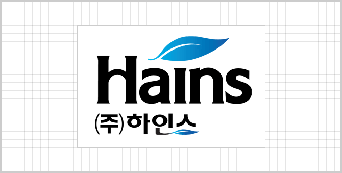 |
Hains Co., Ltd - a company that has strove for the health of our citizens and hygiene under its business philosophy of being a leader in good hygiene practices
By using the plain, simple word-mark format on the name "Hains"- the spelling of which contains
the meaning of “a sterilization system that brings about the required effects of HACCP (Hazard
Analysis Critical Control Points) management”- the logo captures the idea of the cleanliness and
purity of the company, which is leading the way in the preventing the hazards that threaten the health of our citizens.
With the plain, simple word-mark format the image of the company's cleanliness and purity is
expressed; a company that is leading the way in the prevention of the hazardous factors that threaten the health of our citizens.
The creation of the design focused on expressing simplicity and cleanliness in order to emphasize the trustworthiness of the image of cleanliness and hygiene.
Just as a healthy mind requires the basis of a healthy body, the image of the company encapsulates our sincere effort to take a leading role in the health of our citizens through
the positive reform of the hygienic environment in this era of increased consciousness on health and well-being. The image was designed using the leaf symbol and Hains’s
determination to earnestly advance into the future was expressed through the sky blue color.
Hains put a special emphasis on the horizontal connecting dash in the letter "H" in the logo’s design in order to express the company’s determination to
achieve communication between “business and citizen,” and “business and customer” through trust, while being firmly based on products of
outstanding quality and on providing the best service. |
| |
 |
|
|
|
|